Furniture: Finale
- Caitlin

- Jan 31, 2021
- 7 min read

There is far too much to run through this week, the fourth and final one of my whirlwind tour of furniture. Holy hell. I feel like my whole life is furniture now. I want all the furniture. I will never analyze a film's mise-en-scene the same way again. Let's do this.
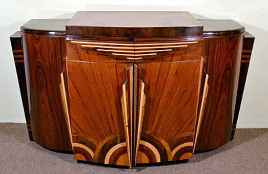
Art Deco! It derives its name from the Exposition Internationale des Arts Décoratifs et Industriels Modernes held in Paris in 1925. It wasn’t formally called Art Deco until the 1960s, however; it was often referred to as Style Moderne due to its overall rejection of nearly everything that came before it. Influenced by new industrial technologies that gave designers novel and exciting materials (steel, chrome, bentwood, Bakelite, tempered glass etc.) and the economic boom in the early 20s, furniture was created with luxury and comfort as top priorities. “Streamlining” was de rigeur, and clean, simplified, symmetrical machine-made lines and shapes dominated, giving everything a futuristic feel. The popularity of Cubist art and the “comprehensive artwork” paradigm of the Bauhaus studio in Germany also inspired Art Deco ideals. Alternatively, the discovery of King Tutankamen’s tomb in 1922 led to a boom in Egyptian stylized features and motifs in much art and design. Art Nouveau, as a prominent parallel movement, managed to lend some (albeit simplified) organic forms to Art Deco’s themes as well.
The vision of Art Deco ranges from stylized dragonflies to chromium-plated everything. Ornament and marquetry is eschewed and replaced by smooth geometry and veneers that emphasized the finest wood grains, such as birdseye maple and burred walnut, polished to a mirror shine. Matching suites of elegant furniture became essential. Upholstery was lush leather and generously padded for maximum comfort, so you may sit back and enjoy your champagne cocktail at the hotel lounge where the poor Depression-era riffraff cannot possibly find you.
The irony of all this, obviously, is that Art Deco got its start while the world, and the United States in particular, was in an economic boom, but the aesthetic held on into the early 30s, providing soup-line unfortunates a nickel’s glimpse at the 1% lifestyle in high-budget cosmopolitan rom-com motion pictures about jetsetting celebrities draped in silver lamé and ostrich feathers. Unsurprisingly, the cocktail cabinet was invented in this era, because you never know when a Gatsby-style party might erupt in the living room nobody actually owns.
I have some feels for Art Deco, mostly related to all the Fred & Ginger films I started watching when I was in high school. How appropriate that my furniture book mentions the impact that the high class sets in 1935’s Top Hat had on American tastes. I mean, if you want to immerse yourself in something that simply reeks with class, that’s your movie. So luxurious. So escapist. Indeed, this movement appears to be the first that literally gets thrust upon a global stage, i.e. motion pictures. It spreads quickly due to the popularity of the films made at the time, but burns out before too long.
As the Depression wears on and right before World War II kicks in, Modernism emerges. Form over function is in, decorative arts are out, and most everyone couldn’t afford anything fancier than an industrialized mass-produced sofa anyway. But the dramatically stripped-down and cold metallic frames bemused regular folks. In their zeal to create radically functional and industrialized pieces, the designers turned everybody off. The Modernism embraced by the Bauhaus school--first led by Walter Gropius--is bold and daring and iconic to this day, but ultimately served more as pleasing sculpture than furnishings. Many of the Modernist designers did double duty as architects, which led to German architect Mies van der Rohe's famous quip:
"A chair is a very difficult object. A skyscraper is almost easier. That is why Chippendale is famous."

Witness Gerrit Rietveld's classic Red-and-Blue chair, often called the 3-D vision of Dutch painter Piet Mondrian's many famous Compositions. Or take Hungarian-born Marcel Breuer's Wassily chair, named for his Russian painter friend Wassily Kandinsky. Mies van der Rohe, who took the helm of the Bauhaus before the Nazis unfortunately drove the school out of Germany in 1933, contributed several singular designs to go with his homes and buildings, including the Barcelona chair and the cantilevered armchairs that blew everybody's minds by doing away with legs altogether.

René Herbst, French designer, came up with the idiosyncratic Sandows chair, whose "upholstery" is a bunch of bungee cords. Irish-born architect Eileen Gray gained much Japanese inspiration after she moved to France and began designing open-plan interiors and furniture there, revolutionizing how furnishings should be viewed as part of a "Reductionist" holistic vision.

Charles-Edouard Jeanneret, better known as Le Corbusier.... Everything he made with his collaborators Pierre Jeanneret (his cousin) and Charlotte Perriand is gold. The Gran Confort, the Cassina, and that grandaddy of chair perfection we all covet, the B306 Chaise Longue. *swoon* The fun part is that Le Corbu first generated a bentwood Thonet-style chaise longue but then he got into tubular steel and the rest is history.

At this time, Scandinavian countries, having no love of cold steel in these perpetually wintry countries, stuck with mostly light wood, and developed what became known as "Soft Modernism" and it's really what everyone loves about Scandinavian furniture these days. One might be forgiven for thinking everything architect Alvar Aalto designed could be found in an Ikea catalog.
Meanwhile, in the US, Frank Lloyd Wright, always happy to try his hand at new styles, designed the entirety of the Johnson Wax building's interiors, furnishing it with the platonic ideal of form-follows-function. I could go on and on, but there's no room and I have to slice up all my home-baked sourdough as soon as I'm done editing this post.
Now we dive into the period that appeals to every discerning millennial who watched MadMen multiple times: Mid-Century Modern. Despite the almost annoying level of lust displayed on Instagram for everything in the Herman Miller catalog, the furnishings themselves truly do represent the height of timeless style and fascination.
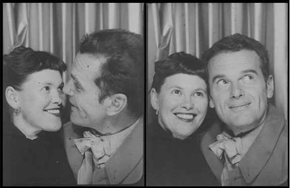
If you're not one to appreciate Charles and Ray Eames, you can fuck right off a cliff. They are heroic and most adorable. Why hasn't anyone made a movie about them yet? They lived in THE BEST house EVER. Fantastic. Perfect. Much love.
But there's also Hans Wegner, who made "The Chair" to end all chairs in 1949. It's been imitated so many times, an entire exhibition was dedicated to The Chair and all its copies over time, but none quite capture its noble purity.

Arne Jacobsen brought us the Swans and Eggs and an entire hotel--the SAS Royal Hotel, Copenhagen's first skyscraper--filled with his curvilicious creations. Finnish architect Eero Saarinen, best known for his St. Louis Gateway Arch and the TWA terminal at JFK airport, birthed the Womb chair for people like Stanley Tucci to melt into as he knocks back his famous lockdown Negroni.

The Artichoke lamp from the Dane Poul Henningsen was born, giving us all the shiny brushed copper glory. Isamu Noguchi brought his simple wood-and-glass coffee table, Carlo Mollino sculpted things that look like womens' bodies, and then there was Luigi Colani, the strange German who worked for an aircraft company for a while and fell in love with plastic, then made an all-in one kitchen pod. which you really have to see to believe. Experimentation ran wild.
Coffee tables became a BIG THING because everyone in 1960s America needed to gather around the TV and eat their microwaveable meals on some kind of surface. Long sideboards and credenzas took over simply because they create far less visual clutter than tall stacks of fucking cabinets (leave the Victorians behind, everyone!). Lamps and lighting--which used to be relegated to a separate discipline from furniture design--came to the fore, especially since they afforded such whimsical opportunities. My favorite is the Arco lamp, by the Castiglioni bros in Italy. So chic.

Throughout the 70s and 80s, the "punk" culture touched all areas of art and design, reflecting the disillusionment of faith in continuous progress by shifting the focus away from the artists and creators toward the viewer/user. Revivalism was scoffed at, objets trouvé were all the rage, and more environmentally friendly materials were tested. Canadian architect Frank Gehry rejected all normalcy and broke barriers of form as well as function with his distorted buildings and chairs made of cardboard. The Italian Memphis group (named for the Bob Dylan song and the ancient Egyptian capital) was founded in 1981, and despite only existing for seven years, it proved widely influential deep into the 1990s, especially in America, spreading its brightly colored offbeat geometric Clarissa-Explains-It-All wackiness everywhere. Full disclosure: I adored Clarissa Explains It All as a tween. She was my fashion idol and I still get a twinge of happiness thinking about all the Saturday nights spent watching new episodes on Snick.

Philippe Starck designed interiors for nightclubs, Werner Aisslinger developed a whole line of seating with "Technogel" cushions, Marc Newson employed computerized design to present a concept car for Ford, Buckminster Fuller unveiled his geodesic domes. As personal computing began to erode factory floor workspaces, Herman Miller created entire office suites, including the now famous Aeron chair. I
n the 1980s, conspicuous consumption took the form of big dining tables that took up unnecessary space and gave the impression that flashy dinner parties were always being had--a conceit that unfortunately continues to this day, leading families to buy ridiculous and tacky dining suites that go largely unused for no goddamn reason other than American consumerism has tricked everybody into thinking that it's just normal shopping behavior to go into debt simply to fill up your garage with junk and you'll never be able to park your car in there and you end up scraping frost off your windshield in the winter when you really should have a fucking yard sale already.
*Deep breath* OK, so I have no chill when it comes to the Postmodern period. Some of it is fine, some of it is batshit, some of it is just not my thing. Ironically, TCM's weekly Pedro Almodóvar screenings this month have been awash with Postmodern stylings, but Pedro totally gets a pass because he is mi amor.
I suppose I am too much of a Millennial with almost no heartfelt nostalgia when it comes to the 90s. The last thing I want to do is re-watch Friends or indulge in a reboot of Full House. The fashion of the 80s and 90s were kinda lame. Let's admit it. I never want to see an antifreeze-green glitter-filled inflatable lounge chair ever again. I enjoyed the first and third seasons of Stranger Things but I am SO over the neon-pink-and-blue everything and the "Jazz" paper cup story. We need to grow up. And re-watch MadMen instead.
While I am not tired of furniture (I covet ALL the furniture), the year of January is finished, and I have to progress towards the next theme of the month: DRAWING. I chose only one book so as to have more time to keep practicing sketches on my iPad, hopefully. We'll see how much my beloved Criterion Channel distracts me with its tempting 21st century foreign cinema offerings. And you never know when I might find yet another Kennth-Branagh-narrated docuseries on youtube that I must watch endlessly for his mellifluous RADA-trained vocals.


Comments